Tuesday, May 29, 2012

My Sibelius Setup

I had a request to post my Logitech G13 Controllermate configuration for Sibelius, so I thought I'd share how I have all of my controls laid out.

Here's how the G13 is laid out: (click for larger version)
Logitech G13 + Controllermate + Sibelius = win.
Each command on the keypad sends a keyboard shortcut to Sibelius. The shortcut either works directly (up arrow = up arrow, Q = clef, etc.) or is bound to a plugin that accomplishes the desired task (Multicopy dynamics, Multipaste text, etc.)

This is the supporting software:

Plugins:
Multicopy Dynamics (Bob Zawalich)
Copy Plugin (Bob Zawalich)
Multicopy Object (Bob Zawalich)
Create Insert Symbol (Bob Zawalich)

This system is set up to behave properly with a Dvorak layout on an Apple Keyboard with Numeric Keypad. You'll probably need to change things around slightly for a QWERTY layout or to use with a different keyboard.

Basics
The circles at the lower right of the diagram represent four positions of the thumbstick. 
The Cmd and Shift keys work as expected, but also serve as modifiers for the layout. Pressing the key directly below the down button (G17) results in the Line command being sent. Pressing Cmd+G17 results in Clef; pressing Shift+G17 = l.v. up.

Dynamics
I have set up 8 instances of Multicopy Dynamics (ppp-fff) with Copy Plugin and assigned them to the top row of keys.

Symbols
I used Create Insert Symbol to make properly-positioned instances of the l.v. up and l.v. down symbols and bound them to Shift+G17 and Shift+G18

Shift Plugins
I made these very simple plugins to move a selected object without changing its attachment location (extremely useful for dynamics, custom articulations and various other structures that you don't want randomly changing on you). They haven't been extensively tested, but should work without too much hassle. Some objects can't be moved with this method; your mileage may vary.

The key to the left of the Left key (G9) is set up as a second modifier. Holding it down and pressing one of the direction keys triggers the plugin moving the selected object .5 space. Holding Cmd+G9 triggers the move 1/32 space plugin.

Quasimodes
Included in this Controllermate (4.5.1) setup are my quasimodes for the function keys on the main keyboard. Holding down F15 brings up the second keyboard layout; releasing it snaps back to the main layout. For more information, check out this post

Trackpad
I use the Apple Magic Trackpad. I have BetterTouchTool setup to configure extra gestures:
5-finger click: Save
4-finger click: Reset Zoom
3-finger click: Esc.
3-finger clickswipe down: Next part
3-finger clickswipe up: Previous part
3-finger swipe left: Undo
3-finger swipe right: Redo

And that's most of it! I run a Mac Mini (mid-2009); 2.53 GHz Core 2 Duo; 4GB RAM. I have two Dell UltraSharp 2405FPW monitors in portrait orientation and use an M-Audio KeyStation 88ES for MIDI entry (step-time only, please!)

I am considering moving to a MacBook Air with Thunderbolt Display. We'll see how things look after WWDC. 

Let me know your setups - I'm always interested to hear how other people set up their rigs.

Thursday, February 2, 2012

Multicopy Dynamics for Sibelius is amazing

I try to keep the material here about the end look of the notation rather than the means to make it possible, but I must make an exception in this case. I've recently been involved with the development of a new plugin for Sibelius that dramatically improves the creation of dynamic markings.

Imagine:

Select a vertical passage with several instruments that all come in at different places.

Press a button.

As if by magic, the dynamic of your choice sprouts at the first note of every staff with notes.

Not only is this a reality, but it's free and available now. It's called Multicopy Dynamics and it was made by the preeminent independent developer of plugins for Sibelius, Bob Zawalich.
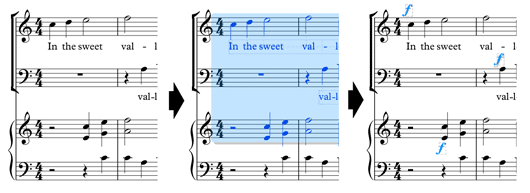
Multicopy Dynamics in action

What follows is some background on my workflow and my desire for an improved dynamics system. Skip to the end for where to get the plugin and tips on how to get the most out of it.

Background

I have been using Sibelius since v.1 for Windows (1999). Adding dynamics has been a constant companion for all that time. The keyboard shortcuts -- ctrl+e+m+f esc and variants -- have long since been ingrained into muscle memory. I was really excited about multicopy in Sibelius 2 (2002), especially because I didn't have to copy/paste dynamics individually. When I got my first macro keyboard (an Ergodex DX1) in 2006, one of the first things I did was to program in shortcuts for dynamics.

So, for the last 6 years, I've had essentially the same workflow: 6 dedicated buttons for the major dynamics that trigger a series of key commands. I would then copy/paste the resulting dynamic to the appropriate staves using multicopy when appropriate.

Logitech G13 gamepad: an
exceptional piece of hardware
For a number of reasons, the Ergodex became increasingly burdensome to use and I recently replaced it with a Logitech G13 gamepad. In combination with Orderdbytes' Controllermate, it is an amazingly versatile tool. Essentially, if I can envision a function, I am usually able to do it with a minimum of effort (chorded keying, extended modifiers, etc.)

My dynamics workflow had some drawbacks. Adding a single dynamic still required as many as five keystrokes to be recognized by Sibelius (quite a while if things were running slowly) and undoing a single incorrect dynamic required two undo commands. Also, while multicopy is useful for straightforward issues, anything more complex than everyone on beat one required a fair amount of handholding.

Project inception

As I was laying out the commands for the new controller, the time seemd ripe to reexamine the dynamics issue. I used Bob Zawalich's Create Add Text plugin to solve two of the issues: adding a dynamic now only required one action, speeding up the response time and only needing one undo command to reverse.

I was prepared to live with this: it was a significant improvement over the previous method. However, I was curious if my complete problem could be solved: one-step creation and multicopy. I don't have any ManuScript experience, so I contacted Bob and asked if he thought it might be possible to do. I figured that he'd either say no and here's why or yes and these are the methods you might use.

What followed was nothing short of amazing. Let me first stress that Bob doesn't make custom plugins; he only works on projects he feels are applicable to the community as a whole. At first, he wrote back saying that it would probably not be worth the effort to make. A few days later, though, he contacted me saying that he was playing around with some ideas and if I wouldn't mind testing them. What followed was a very rapid development of this plugin to a mature state.

He started out by just creating text at the beginning of all staves in a selected passage. This worked well, but didn't allow for text to be created at a single selected object. The next revision added this feature. At this point, I was very happy as my original goal had been satisfied. However, I got curious and asked if text could be created at all discretely-selected objects. Sibelius' native multicopy doesn't handle that situation (though it's not clear that it actually should). Soon afterward, Bob sent an update with that feature.

After working with the plugin, it became apparent that what really needed to happen was an upgraded filter. I don't want dynamics on empty staves or under most rests. I asked further: could I have the dynamic attached to the first notes in a given staff selection? Lo and behold, the wish was granted.

This took the plugin from a useful little tool to an exponentially faster and smarter way to interact with the program. At this point, it was pretty much done. Bob added polish in the form of specific voice selection and various dialog hiding options.

How to use for maximum effect

What it does depends on the nature of the selection: if a passage is selected, it finds the first note in each bar and creates a piece of predefined Expression text at that location. If several objects are selected, it will place the text at each of those locations.

The basic function of the plugin is probably adequate for most people: select a passage or individual objects, run the plugin, and choose what you want from the menu. Fast, simple and easy.

To supercharge it, though, you will need a copy of it and the Copy Plugin plugin (echo!) available here. (or under File > Install Plugins. Copy Plugin is under "Developer Tools", Multicopy Dynamics is under "Text")

The end goal is to have eight separate plugins, each dedicated to a specific dynamic ( ppp to fff ) and each bound to a different key command.
  1. Once installed, run Multicopy Plugin and select ppp. Press OK.
  2. Run Copy Plugin and change the name to something descriptive like ppp.
  3. Repeat for the 7 remaining dynamics (or the text of your choice)
  4. Restart Sibelius
  5. Run ppp and select "Hide Dialog Always" from the Hide dialog options dropdown (the dialog will pop up if nothing is selected when you trigger the plugin)
  6. Repeat for the other 7 plugins
  7. Bind each plugin to a different key command in Sibelius Preferences > Keyboard Shortcuts > Plug-ins
  8. (Optional bonus!) Bind those key commands to a macro keyboard for one-touch access.
Use cases
  • Full score: a passage that includes several instruments who all need to be ff
  • Full score: scattered identical dynamics
  • One line: a hairpin cresc./dim. from and to a single dynamic. ( p < f > p )
  • Normal one-at-a-time dynamics
It just works. Take a breath of fresh air and watch those deadlines get just a bit farther away! Once you have those dynamics in, make sure they're properly positioned!

I want to thank Bob Zawalich for making this dream a reality. I am thrilled that this is in the world and hope that many many people find it useful. 

I would love to hear your comments on the plugin or how you're using it!

Links:
Multicopy Plugin (bottom of page)
Copy Plugin (middle of page)

Optimal Horizontal Dynamics Placement

Basic horizontal dynamic placement tends to lack nuance in current practice. The various software packages simply define a default position for a given text style and leave it to the user to do any manual changes. In practice, this often means that basic dynamic positions are simply left as is with little thought to historical convention or good aesthetics. They tend to get adjusted in awkward situations, but rarely otherwise.

Standard dynamic placement isn't treated with much depth in the major texts, but two main objectives are evident:

Gould: "Centre the dynamic on the notehead" (p. 102)
Ross: "A multiple mark straddles the stem of the notehead which it is beneath" (p. 186)

The following chart proposes default positions for the major dynamics; offsets are given in spaces from Sibelius defaults. Finale treats dynamic placement differently, but the idea is the same.

Optimal Dynamic Placement
(Click for larger version)

In a score system, I will take the leftmost dynamic on a given beat and align all the others to it. It's more important in that situation to have a unified line of dynamics so the conductor can quickly grasp the change. These positions are for isolated dynamics and to establish baseline left side positions.

I will be interested to hear your thoughts! It would be very nice if the software packages were able to make these adjustments automatically, but that's why I stay in business.

Update:

Jeremy Hughes suggests that my positions are a little bit further to the right than he would like. I agree with him. Instead of centering the cleft of the p and the crossbar of the f, I am now centering the bowl of the p and the upper curve of the f. Here's a revised chart with a couple of extra dynamics:
Revised dynamic placements
(Click for larger version)
Let me know what you all think in the comments!

Friday, January 27, 2012

My ultimate engraving project

Does anyone remember the "Faerie's Aire and Death Waltz?" I remember seeing this extraordinary piece of engraving hanging on many music school bulletin boards. I had no idea that the fellow behind this work was responsible for two more lesser-known works of the same type. The story behind the man, John Stump and high-resolution scans of his pieces can be found here.

I think it would be a rollicking good time to duplicate these pieces -- they are exquisitely difficult tours-de-force of engraving, on a par with anything Ives has to offer. I will put the "Faerie's Aire" in the queue to be worked on in spare time and will post it here when it's completed.

Curiously, two of the pieces, "Fairie's Aire" and "Prelude and the Last Hope" are hand-engraved (possibly on a music typewriter), and seem to date from the early 70s. The string quartet, though, is from 1997 and looks as though it was produced in Finale (probably v.3ish). The temptation for fonts must have proved too much for him -- several are indiscriminately used throughout. In my reproduction, I will aim for a more restrained expression of the work, if such is possible!

From the Lost in the Cloud blog post referenced above:

Fairie's Aire:


Prelude and the Last Hope:


String Quartet (p.1):

Monday, January 16, 2012

Hammered glissando for percussion

I was recently required to make a glissando for mallet percussion instruments that asked the performer to hammer all the way through rather than just slide the mallet across the bars. The standard way to indicate articulation in a glissando is to have headless stems with the desired rhythm. This was my first proposal, but it fails to fully capture the requirement:

Since it explicitly requires a rhythm, the performer would be likely to attempt to be precise in its execution. The desired outcome is to have an unmeasured flurry of hits all the way through the figure. My eventual solution was as follows:
The 32nd notes with extended beams suggest that the figure is unmeasured and very fast. The whole note defines the starting pitch and duration of the gliss. The text clearly states the requirement. Result: no confusion.

Update: John pointed out that having the mixed roman and italic text looks odd, especially following the line. I think that a better solution is to treat the text as a technique and have it all in horizontal roman type as follows:


Wednesday, July 13, 2011

Behind Bars readthrough: Chapter 1: Stem thickness and Center line direction

Welcome back to the readthrough for Behind Bars. To get started, you can see the previous posts in the series:  Introduction and Staves, clefs and noteheads.

In this post, I cover stem thickness and single-note direction.

STEMS


Thickness: Gould suggests that the stems should be thinner than a stave line, but not too thin. I believe that she is quoting Ted Ross here. However, the examples in Ross' book have (to modern eyes) quite thick stave lines. Perhaps the lines had to be scored thicker or deeper in order to stand up to the punching and smoothing process.

Stephen Powell in Music Engraving Today (Brichtmark, 2007) suggests that both stems and stave lines should be the same thickness, but to increase that thickness slightly as the size of the staff gets smaller. Sibelius puts the default thickness of both stave lines and stems at 0.1 spaces; Finale puts the default thickness of both stave lines and stems at .075 spaces.

Edward Tufte, the information display guru, suggests that stave lines are a form of "chartjunk," clutter that obscures the data in an information graphic. In Envisioning Information (Graphics Press, 1990), he recommends printing stave lines thinner and in gray. This has the effect of popping the notes off the page and making them very clear while maintaining the pitch information.

Comparison of stave line thickness
Variations in stave line thickness alter readability
To my eye, Ross' lines are too thick; they imprison the music rather than encourage easy reading. I find that Tufte's approach is very interesting, but may lack feasibility in the real world. The more delicate lines certainly have the effect of putting the notes dramatically frontmost, but care must be taken to ensure that the lines are not so light that they blend into the background or disappear altogether. Inferior reproduction and printing methods will tend to wash out the lines, rendering the music unreadable. Neither Sibelius nor Finale offers a method to easily make stave lines gray.

My recommendation is to stick with the middle ground – stems and stave lines should be the same size, or perhaps the stave lines could be a little thinner to push them into the background more. Experimentation will reveal a balance point somewhere, much like choosing lenses at an optometrist's. It's curious to note that Gould's examples all feature stems and stave lines that are exactly the same thickness, contravening her own recommendation.

Direction: For single notes, the standard convention: notes above the middle line have down-stems; below have up-stems. The middle line is where things get interesting.

Gould surprisingly recommends an option for the middle line: the direction of the stem is determined by the surrounding stems. If there's no clear-cut case for either direction, use a down-stem.

A selection of quotes on the matter:

Read (1969): "When the note is centered on the staff, ... the stem may go in either direction, although it is the more common practice to draw it down."

Stone (1980): "The old rule that the stem direction for notes on the middle line of the staff is governed by the majority of the other stems in the measure ... is rarely if ever followed any longer, at least not by today's professional engravers and autographers."

Ross (1987): "Some engravers consider the middle line neutral, and take the option of using either up- or down-stems for notes that fall on it. However, more up-to-date engraving no longer permits an option; now a down-stem is always appropriate"

Chlapik (1991): "Alle Noten, die unter der Mittellinie stehen werden hinauf-, ab dieser und darĂ¼ber heruntergestrichen."/ "All notes below the middle line will be up-stemmed, on and above the middle line will be down-stemmed."

Powell (2007): "When there is one note and it is on the middle line of the staff or higher, the stem goes down."

So: why does Gould go back to the old style? I expect she feels that it just looks better: stemming the note with its neighbors assists with the flow of reading and maintains smooth phrasing. What prompted the shift away from this practice? Why is it so bad to have an up-stemmed middle line? None of my sources gives an explanation – does anyone know?

Next time: Stem length and tails!

Thursday, June 2, 2011

Behind Bars readthrough: Chapter 1: Staves, clefs and noteheads

Ground Rules: in which the basics of notation are established and expounded upon. For an introduction to this project, see the first post. Throughout Behind Bars, British naming conventions are in use: stave, crotchet, minim, etc. I shall use her terminology where applicable and revert to standard American where appropriate.

Sections:
The stave [staff]
Clefs
Noteheads
Stems
Tails
Beams
Ledger [leger] lines
Octave signs
Rest symbols
Barlines
Rhythmic spacing
Spacing symbols

The stave:
The stave is the basis for all musical measurement. A stave-space (or, in American, staff-space) is the distance between two stave-lines and serves as a fundamental scalable unit. The stave size may change, but the proportional relationship of symbols does not. We will discuss appropriate stave sizes much, much later.

Almost all music is written on a five-line stave as it is immediately recognizable. The other frequently-used stave type is that of a single line. Its primary use is for indefinite pitch of all sorts and as a baseline to show approximate pitch. Two- and three-line staves are useful in percussion music. Kurt Stone recommends against four-line staves because players can more readily grasp positions on a five- or three-line stave. (p. 216)

Clefs:
Recommended
Percussion Clef
Gould outlines the basic clefs: treble, bass, and the various C clefs. She recommends a double vertical-stroke clef for percussion and notes that it is optional for staves of fewer than five lines.

We will talk about the horizontal spacing of initial items (clef, key signature, time signature and initial note) a little later.

Her recommendations for changing clef are quite thorough and expand significantly on Ross, Read and Stone. Stone notes that clef changes should come one space before the barline and that "there are no specific rules for clef changes within a measure" (p. 46). Ted Ross and Gardner Read have some recommendations, but fall somewhat short of comprehensive.

Consensus rules for clef changes:
  1. Use a clef change where there is an extended constant use of ledger lines
  2. Avoid frequent clef changes (Gould: use up to three ledger lines rather than changing frequently. Preserve the contour of the line wherever possible.)
  3. Use a clef two-thirds of (Ross: two or three sizes smaller than) normal for the change.
  4. Generally place the new clef immediately before the note involved.
  5. If the change affects an entire measure, place the clef before the barline
  6. For mid-bar changes, use the whole beat immediately preceding the affected notes (Gould adds to use half-beats or other subdivisions if necessary.
Gould's additions:
  1. Changes between beats come after rests.
  2. It is better to keep the phrase contour intact rather than to keep to whole beats.
  3. Avoid changing clefs between ties; if you must, use a system break
  4. After periods of rests, change back to a conventional clef at the end of the system after the player has finished. If changing to a nonstandard clef, change according to foregoing rules.
Common clef change situations. Examples adapted from Gould: Behind Bars.

Comments:
Gould’s recommendations amplify the standard texts in very helpful ways. Her central aim is to preserve the contour of the line and disrupt spacing as little as possible. The suggestion to change back from a nonstandard clef to standard is very interesting. When you put the change back at the end of a line, it's almost invisible. The next line starts with the proper clef and the performer doesn’t get the double-take when the new clef appears immediately before playing.

Noteheads:

Black noteheads: oval shape that slopes away from stem.
White noteheads: 
  • Minim (half note): oval shape with diagonal shading following slope of the oval.
  • Semibreve (whole note): wider oval shape with shading slightly left of perpendicular.
  • Breve (double whole note): may have two lines, one line or be rectangular in shape.  
Diamond shaped noteheads are used for the following functions:
    • harmonics in instrumental writing
    • silently depressed keys in piano music
    • differentiate unconventional techniques
    • singing through a wind instrument
    • multiphonics
    • unvoiced vocal sounds
    • falsetto
Crossed noteheads are unshaded and fill a stave-space. Steven Powell in Music Engraving Today (Brichtmark, 2007) suggests to use a double-sharp sign in place of unshaded lines because it is more visible on the page. Gould demurs, recommending reserving the double-sharp sign for its role as an accidental.

Showing a minim or semibreve with a crossed notehead is done in one of two ways: a small x in the middle of an unshaded circle the size of a minim or semibreve or as diamond noteheads. I find that diamond noteheads are significantly easier to read.

Uses for crossed noteheads:
    • notating sounds of indefinite pitch on a five-line stave
    • to distinguish certain instruments in percussion writing
    • spoken text
    • differentiate between speech and singing
    • showing approximate pitch
Triangular noteheads are used for the highest or lowest possible pitch, where it cannot be specified. It may be black or white depending on duration and does not take a leger line.

Comments:
Gould specifies that semibreve noteheads have a ratio of 2.5 to 3 black noteheads. This seemed off to me. I took several music fonts in current use and compared the sizes of black to semibreve noteheads and came up with a different result. Her ratio works out to .833; the actual number ranges from .71 to .76 with an average of .73. The designers of these fonts need to balance two things: ease of legibility and evenness of color. When the size of the black notehead and half-note is closer in size to the whole note, the page can flow more evenly, but it is subtly more difficult to quickly tell the difference between half and whole notes. If the ratio is too small (and Petrucci approaches this point) the line tends to have hitches in it which impede facile reading. 

An interesting side-effect of this exercise is the illumination of the various widths of the fonts. Opus is by far the widest music font and Petrucci the narrowest. Opus' generous space invites easy reading, but Maestro and Helsinki may be better suited to tightly-packed spaces. Sonata and Petrucci are quite outdated at this point and engravers will be better served with other choices. I would welcome comments from those more informed than I on this topic.

Next week: Stems, tails and beams (hooray beams!)